29 Jul Top 7 Essential Things to Keep In Mind While Designing A Logo
Every brand needs a logo, as a logo represents what the brand stands for. A logo impacts much on customers and how they perceive the brand, so naturally, it needs to stand out. If you are in a creative job and designing a logo, then do not fret.
Here we will be providing some good logo-making tips that will complement your creativity and capture the attention of the targeted customers.
A logo is one of the powerful assets for your client’s brand but creating visually compelling representation requires much more than just a graphic designer. Like any skill, logo designing also needs practice and experience to make it a success.

Things to keep in mind while designing a logo that will help you create an effective logo for your client’s brand are:
1. Font Family
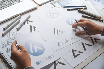
Put all your ideas and designs concepts down on a paper like the old fashion way. Among the tips for creating a logo, this will be the most time-consuming of all, but rushing ahead might compromise the result that you will create.
As you start with the preliminary sketches, the drafts will keep on branching out and provide variations to your original idea.
There are many fonts available this preliminary work will help you play with them and see which will prove effective for your logo design. Even in the fonts, you can then make use of various settings to determine the size and shape of each font which will suit your purpose.
2. Color Combination
Though using color is complex while designing a logo, the designers who understand the basics of color combination can use it to their advantage. There are some basic logo-making tips while considering the color combination, like using colors near each other and avoiding the usage of bright colors, which are hard on the eyes.
The logo should also look great in a black and white combination as well as grayscale and two colors.
Knowing which colors will evoke the desired emotions is a necessary trick that you should learn as a designer. For instance, a red color will evoke the emotion of aggression as well as passion. Playing with particular colors is also a good idea; some brands are solely known for their distinctive color.
3. Simple Look
You can use or develop different design styles while drafting a logo, but one thing to keep in mind while drafting a logo is that it should not be complicated and should suit the company’s brand that you want to portray to the masses.
To do so, you should first study the company and the sector with which the brand deals to get perspective about the business, which will help you create the logo.
Your objective should be delivering many things with just a simple look of the logo, which will appeal to the masses and use different forms of advertising, both digital and canvas.
If you are inserting a tag line as a part of your logo, it should be simple and crisp, and you will have to spend a lot of time on the type of font and how it goes along with the logo. Test it on yourself before finalizing it, work the design down to its essence, and leave out the unnecessary elements.
4. Placement of Icon
The whole point of developing a logo is recognition and building a brand. Other aspects of the logo may vary, but recognition by the masses is, and always the preliminary goal of creating a logo, and placement of it on a letterhead or on the product plays a vital role.
The logo should be placed in such a way that it is easily visible, and the targeted audience can easily recognize it; hence all the elements of size, style, typography, color, and originality play a vital role in deciding the placement of the icon.
5. Logo size
A logo design needs to be balanced as research has determined that a balance designed is perceived as pleasing and appealing. The logo needs to be kept balanced by keeping the colors, weight, and equal on each side of the font. The balance rule can be broken, but be sure that the logo will be viewed by the masses, so a balanced logo design is the safest approach.
When you design a logo, the size also matters; it needs to be good as well as legible at all sizes. If the logo’s fonts are scaled to a letterhead size or small promotional items, they are not effective. One of the logo-making tips is that each logo looks good when used in a larger format or electronic format.
To get the fonts right, print them on a letterhead or an envelope, as the smallest range of font size is usually the hardest to get right. You can also get the large-scale rendering by printing a poster-sized version but getting the size right off the font logo must be your priority and you should do it on your own so that there are no surprises later.
6. Choose the right tools
There are many digital tools available like photoshop, freehand, adobe illustrator, and other graphic design tools that are powerful tools and have many settings that you can use to create a logo but don’t get carried away.
Get proficient with the tool you are comfortable with, learn and practice with each setting that the tool provides; it will help you create the logo you wish to portray. But always remember simplicity will play a vital role in logo designing.

7. Logo Perspective
The golden tips for creating a logo are never to copy it from other designs; you can take inspiration from them only. To get your logo perspective, you need to conduct research for it by understanding the company and its products.
Once you have congregated all the information, start drafting the logo to deliver the idea that the client wishes to tell its targeted audience.
Logo Design Company in Gujarat is adapting to following the above rules while designing a logo for a brand of a company giving an effective and well-researched logo.
Also Read: 51 Creative Logo Design Ideas With Examples

